| Share/Comment | |||
 |
Tweet |  |
|
 |
Feedback |  |
|
We are bombarded with tons of data everyday in a business environment. The key challenge is how to convert this data into information and information into knowledge and finally knowledge into wisdom. While wisdom is an individual's ability to apply knowledge or understanding in a given situation; it is the transformation of data into knowledge where statistics comes to our rescue. Statistics is the science of collecting, organizing, and interpreting data whether it is numerical or non-numerical. In other words, statistics helps us measure our business processes leading to higher order of manageability.
H.G. Wells, the father of science fiction, predicted that statistical thinking would one day be as necessary for efficient citizenship as the ability to read and write. Like many of his prediction, this is so true in today's context.
Statistics seems intimidating in the beginning but it is not once you develop a clear understanding of this simple subject. Let us explore the simplicity of statistics. At this point, it may be a good idea to pause and quickly revisit our discussions in section on Introduction to Six Sigma.
Statistics is classified into two categories: descriptive statistics and inferential statistics. Descriptive statistics addresses data collection, presentation and characterization. Let us recall our famous pizza example. We collected data on delivery time of 5000 orders and found that the average delivery time, a characteristics of data, was 16 minutes. This is an example of descriptive statistics. Inferential statistics covers estimation, drawing conclusions, decision-making, and hypothesis testing. Our inference that almost 99.7% deliveries will always be made on time is an example of inferential statistics.
Basic Statistics
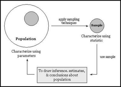
Lets introduce a few formal terms that are used frequently. Population is the collection of things under consideration. It is also referred as the universe. Sample is a portion of the population selected for analysis. We use sampling techniques to select a faithful representation of the population. Parameter is a summary measure computed to describe a characteristic of the population. Statistic is a summary measure computed to describe a characteristic of the sample. The following figure illustrates the concept behind above terms graphically:
Understanding Data
Understanding data is the first step in the journey of statistics (and also Six Sigma). Data is "something" known or given about a specific subject or situation. In other words, it is raw facts or figures such as last 5 years revenue figures of a company or colors of trousers that John has in his wardrobe.
Data can come from different sources. Data sources can be categorized in two broad categories viz. primary or direct and secondary or indirect. Experimentation, observation, and survey are examples of direct or primary data sources. Precompiled data drawn from print media or electronic media is an example of secondary or indirect data source.
There are two types of data - quantitative or numeric and qualitative or categorical. Last 5 years revenue figures of a company is an example of quantitative data. Colors of trousers that John has in his wardrobe are qualitative data.
Organizing Data
Organizing data leads to discovery of meaningful pattern and characteristics from the data. These patterns or characteristics are usually range of data, growth or decay patterns, what values appear most often, some kind of central tendency in data or scatter in data. Type of data determines the data organization technique.
Organizing Quantitative Data
The simplest way to organize raw or unordered quantitative data is to sort it in a specific order. Once sorted, more meaningful representations like stem & leaf diagram, frequency or cumulative distributions and graphs can be created.
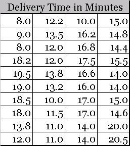
Let us go back to our pizza shop example to develop a clear understanding. Here is some raw pizza delivery time data, collected during first half of a day.
This data can be easily sorted in ascending (or descending) order.
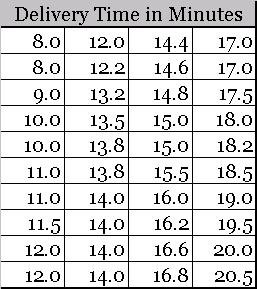
Once sorted, we can easily create a frequency distribution table using the following procedure.
- Find the range of data. In our case it is (20.5-8) = 12.5.
- Select number of classes, usually between 5 and 15. Note class is group (or range) of similar values of data points. We have chosen 7 classes.
- Compute class interval (or range) by dividing the range of data by number of classes and subsequently rounding the result. For us it is 12.5/7 = 1.79 or 2.
- Determine class boundaries for each class. In our case, first few classes are 8 minutes to less than 10 minutes, 10 minutes to less than 12 minutes.
- Finally count the data points for each class and assign to classes.
Here is the final outcome.
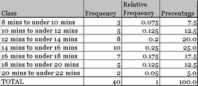
This data can now be easily transformed in to a frequency distribution graph or a histogram. The following figure illustrates the final graph. Note x-axis represents the class and the y-axis represents the frequency.
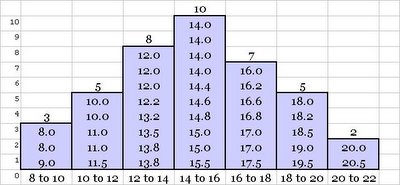
The figures in each bar are the data values that lie within the corresponding data class interval. A frequency distribution table or graph illustrates as to how the data is distributed within the range of the data. Distribution is a very important concept in context of Statistics and also Six Sigma and is separately discussed in detail.
Another quick way to explore data is stem & leaf diagram. Let us take the above pizza shop data and create a stem & leaf diagram. We begin with list the stems vertically. Stems are the unique digits before the decimal point. Thereafter, we write down leafs corresponding to each stem in from of it. Leafs are the digits after the decimal point. The following figure illustrates the concept.
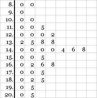
This is a very quick way to get an approximate picture of the frequency distribution.
Organizing Qualitative Data
In case of qualitative or categorical data, we are usually interested in count of events in each of the categories. For example, recall the customer complaints data collected in our pizza shop example.
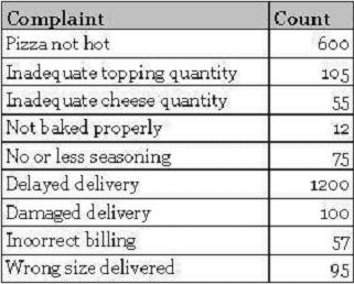
This is nothing but the count of complaints in each category of complaints. A special case of this type of data is yes/no data, where there are only two possible outcomes. An example of yes/no data is the presence or absence of a defect.
This type of data can be represented in form of summary tables or graphs like pareto, pie or bar. For a detailed example, please see section on Pareto Chart.
Determining Data Characteristics
During data organization, we tabulated the data, drew graphs, and discovered patterns such as frequency distribution. We are now ready to compute two key characteristics from the data. These characteristics are measure of central tendency and measure of dispersion or scatter.
Other specific advance topics related to Six Sigma are explained separately on a need to know basis. Some such topics are distribution, central limit theorem, etc.
comments powered by Disqus
Commenting Guidelines
We hope the conversations that take place on “discover6sigma.org” will be constructive in context of the topic. To ensure the quality of the discussion stays in check, our moderators will review all the comments and may edit them for clarity and relevance.
The comments that are posted using fowl language, promotional phrases and are not relevant in the said context, may be deleted as per moderators discretion.
By posting a comment here, you agree to give “discover6sigma.org” the rights to use the contents of your comments anywhere.