| Share/Comment | |||
 |
Tweet |  |
|
 |
Feedback |  |
|
Scatter plot is a technique to discover relationship between a dependent variable (y) and an independent variable (x) by plotting “y” against “x”. Once plotted, it is very easy to spot the correlation between “x” and “y” variables. For example, the following scatter plot between pizza delivery time (y) and the delivery distance (x) reveals a possible linear correlation.
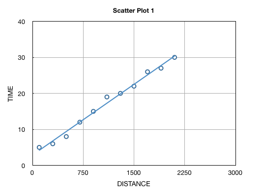
Such analysis is the first step towards determining the maximum delivery distance or the nearby areas, where this pizza outlet will be confident of 30 minutes delivery (after taking in to the account pizza preparation time and of course variation).
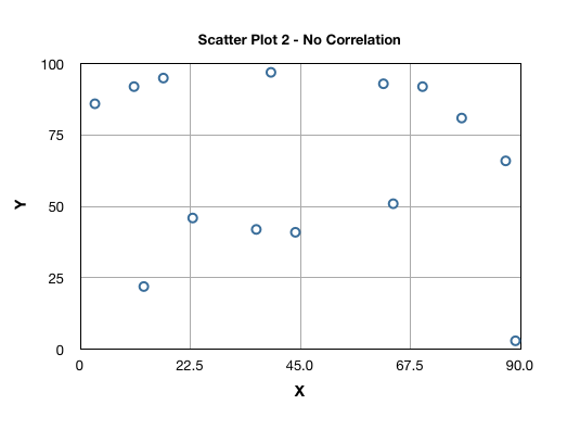
Let us now look in to various commonly found correlation patterns in scatter plots and their interpretation. Scatter Plot 2 indicates no correlation between variables X and Y variables:
Scatter Plot 3 illustrates a curvilinear relationship between X and Y variables:
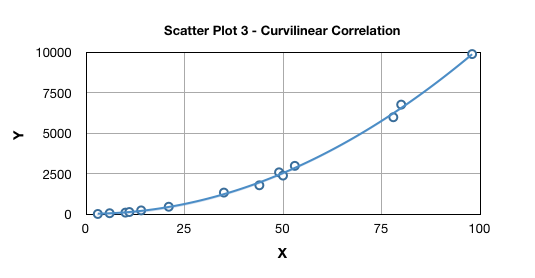
This relationship is a relationship between two or more variables which is depicted graphically by anything other than a straight line. Curvilinear relationships can be broadly of 2 types viz. polynomial and exponential. A polynomial relationship in one variable is expressed as:
A linear relationship is a special case of polynomial relationship where n=1 leading to y = a1x + a0 or y = mx + c.
An exponential function in which the independent variable appears as exponent (i.e. as the power) as shown in the example below:
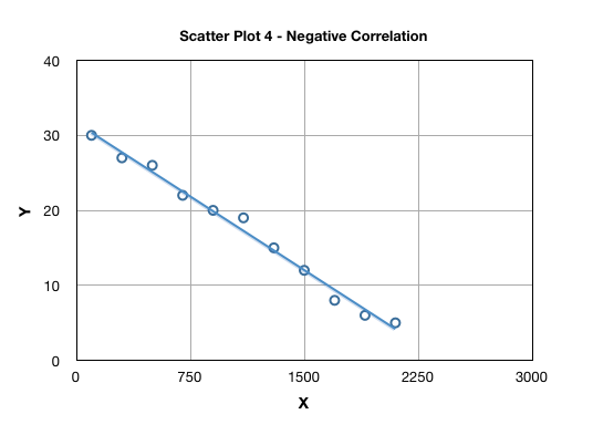
The correlation can be either positive, i.e. “y” increases with increasing “x” or negative, i.e. “y” decreases with increase in “x”. This is also referred as direction of the correlation. Scatter Plot 1 above is an example of positive correlation; and Scatter Plot 4 highlights a negative correlation:
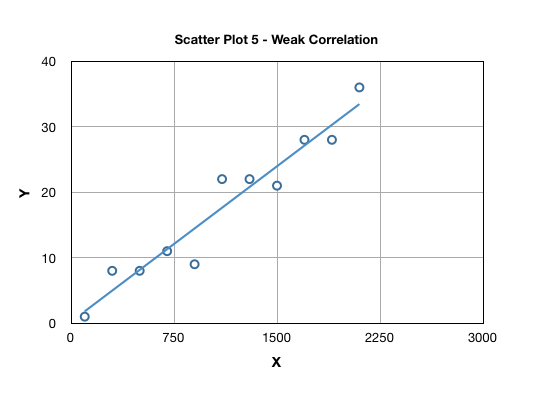
The degree of scatter in a plot suggests the strength of correlation, typically attributed as “weak” or “strong” as highlighted in Scatter Plot 1 and 5.
To summarize, a scatter plot reveals (a) type of correlation, e.g. linear, polynomial or exponential; (b) direction of correlation, e.g. negative or positive; and (c) strength of correlation, e.g. weak or strong. Some scatter plots may exhibit presence of clusters and outliers also. The pattern or trend revealed in a scatter plot helps us select an appropriate regression model. A common model in use is a simple linear regression, where the correlation is represented using a equation y = mx + c. Such a model may be used to predict values of “y” on the basis of “x” values. Correlation is established by applying the appropriate model.
Sometimes no correlation may be observed due to the fact that the “x” and “y” data is a combination of data obtained from multiple sources. Examples of such multiplicity of sources are shifts, machines, and days of week.
Correlation does not necessarily imply causation
While causality implies correlation but correlation does not necessarily mean causation. A classic example of a false correlation is where you may observe a positive correlation between number of fire fighters deployed to fight against a fire and the extent of property damage. Does that mean that more fire fighters lead to more property damage in an fire accident? No! More fire fighters are required to handle a large fire. A third hidden or lurking variable (in this case size of fire) may cause a false correlation or association between “y” (extent of property damage) and “x” (number of fire fighters) variables.
comments powered by Disqus
Commenting Guidelines
We hope the conversations that take place on “discover6sigma.org” will be constructive in context of the topic. To ensure the quality of the discussion stays in check, our moderators will review all the comments and may edit them for clarity and relevance.
The comments that are posted using fowl language, promotional phrases and are not relevant in the said context, may be deleted as per moderators discretion.
By posting a comment here, you agree to give “discover6sigma.org” the rights to use the contents of your comments anywhere.